Northwestern Mutual
Mobile App
BACKGROUND
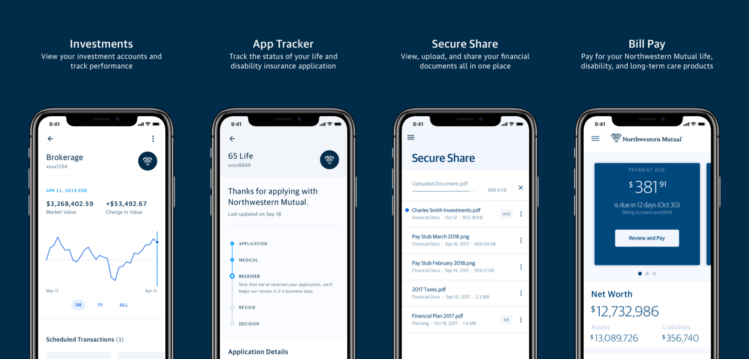
Northwestern Mutual’s (parent company of LearnVest) client-facing app allows policy holders to understand high-level facts about their financial situation and communicate with their financial advisor. That includes document sharing. I joined the team after the app launched and immediately began working with the team and product partners to evolve the app.
TASK
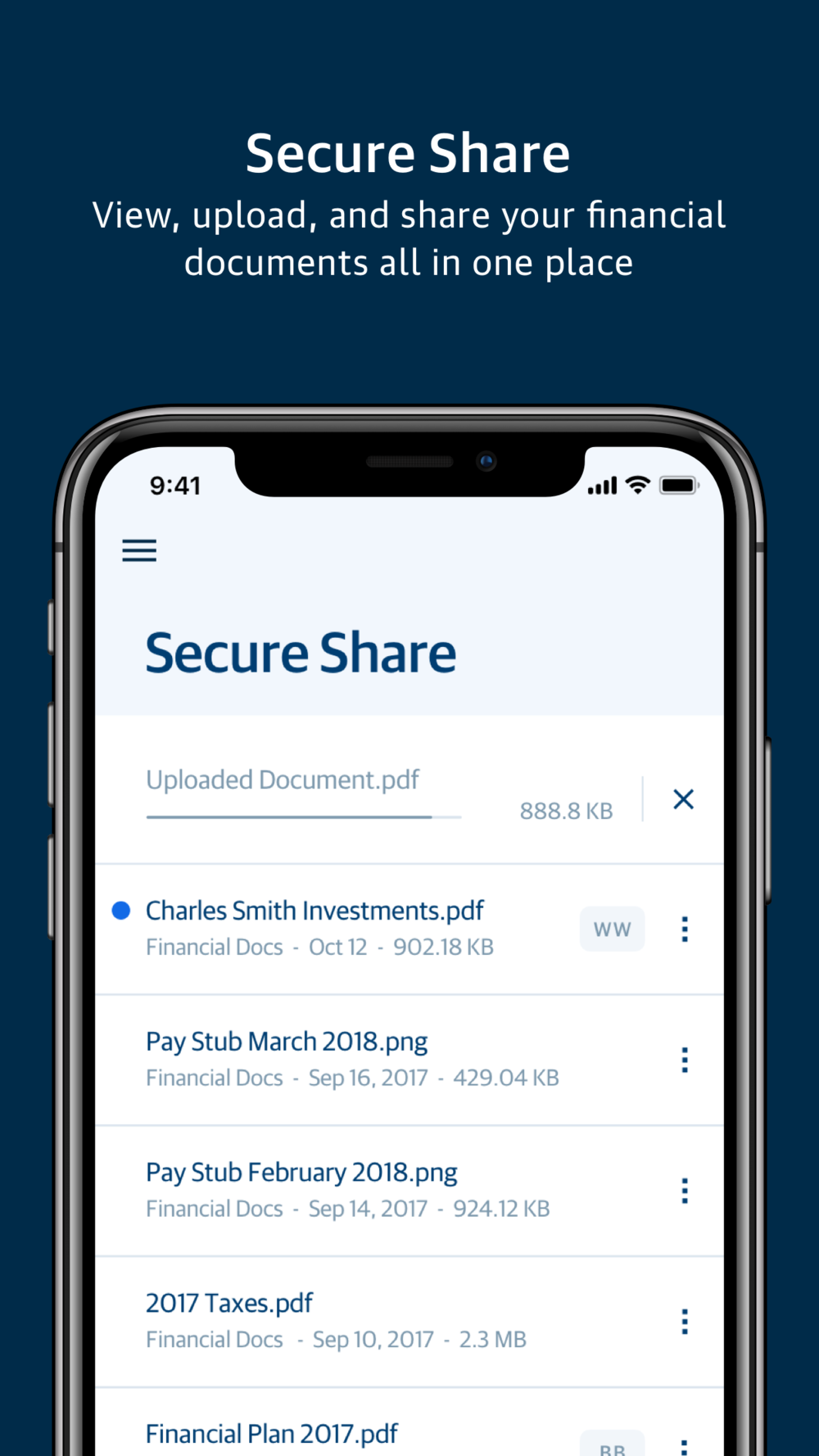
One of the most asked features from clients and NM’s financial advisors was to have the ability to share important documents with each other. So we built out an MVP for this feature– Secure Share (iOS & Android) to be implemented in the NM app (iOS App Store & Android Play Store)
MY ROLE
As the design lead in the native team, collaborated with our UX researcher to conduct interviews with a diverse range of users. Gathered feedback and designed flows (wireframes) that addressed the different use cases and designed the overall experience.
PROCESS
Given the short time to launch an MVP, we decided as a team on this process:
Discovery / Ideate / Validate
– Defined the problem, competitive analysis, defined users and put together quick design mocks which were used for research (interviews for usability )
Execute
– Based on user feedback, designed hi-fi task flows that were efficient and fluid. Addressed edge cases.
Measure
– Post launch, tracked metrics like: engagement, drop off rates, task success rates, task completion time.
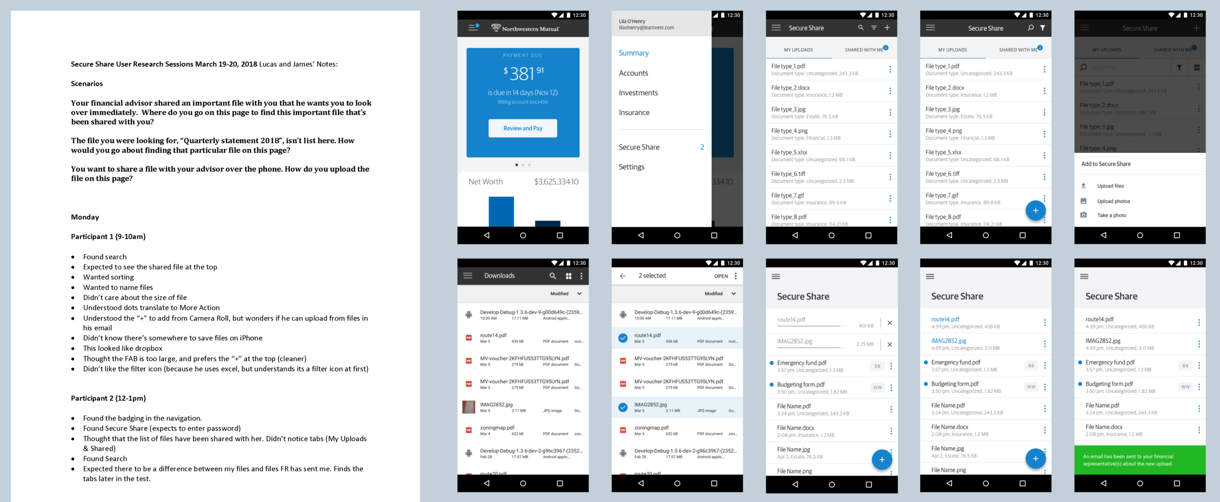
Sample research notes (scenarios and participant feedback) and sample wireframes we tested for usability.
Some of the scenario-based tasks we asked our interviewers were:
Your financial advisor shared an important file with you that he wants you to look over immediately. Where do you go on this page to find this important file that’s been shared with you?
The file you were looking for, “Quarterly statement 2018”, isn’t list here. How would you go about finding that particular file on this page?
You want to share a file with your advisor over the phone. How do you upload the file on this page?
Some Takeaways from Research:
All participants wanted to use the hamburger menu to navigate to the Secure Share page. The majority of participants assumed “2” (badging) meant the number of messages/emails the FR has left for them, but it was clear once the nav was open that it was to direct them to the shared files on Secure Share.
The majority of participants preferred the version with the Floating Action Button (FAB), as it’s considered more noticeable and easier to access than having the “+” sign buried in the header.
It was unclear if the funnel icon meant filter or sort. Participants wanted some form of organization based on date, file type or sender.
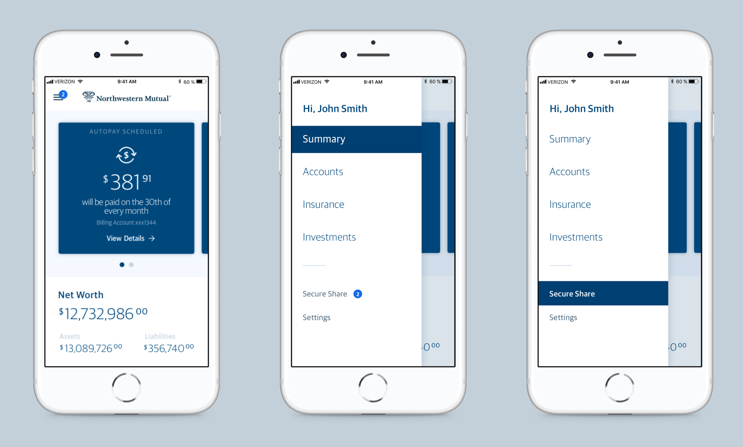
Sample key screens: Navigation
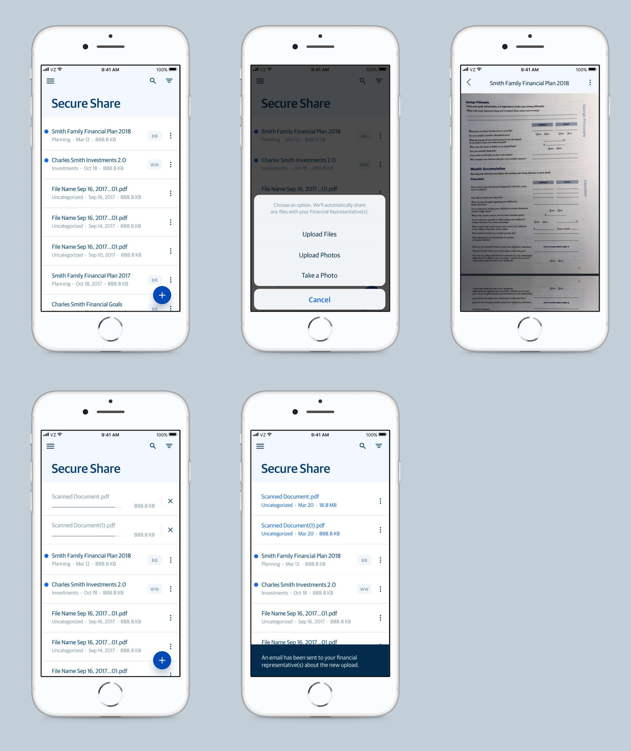
Sample key screens: Upload
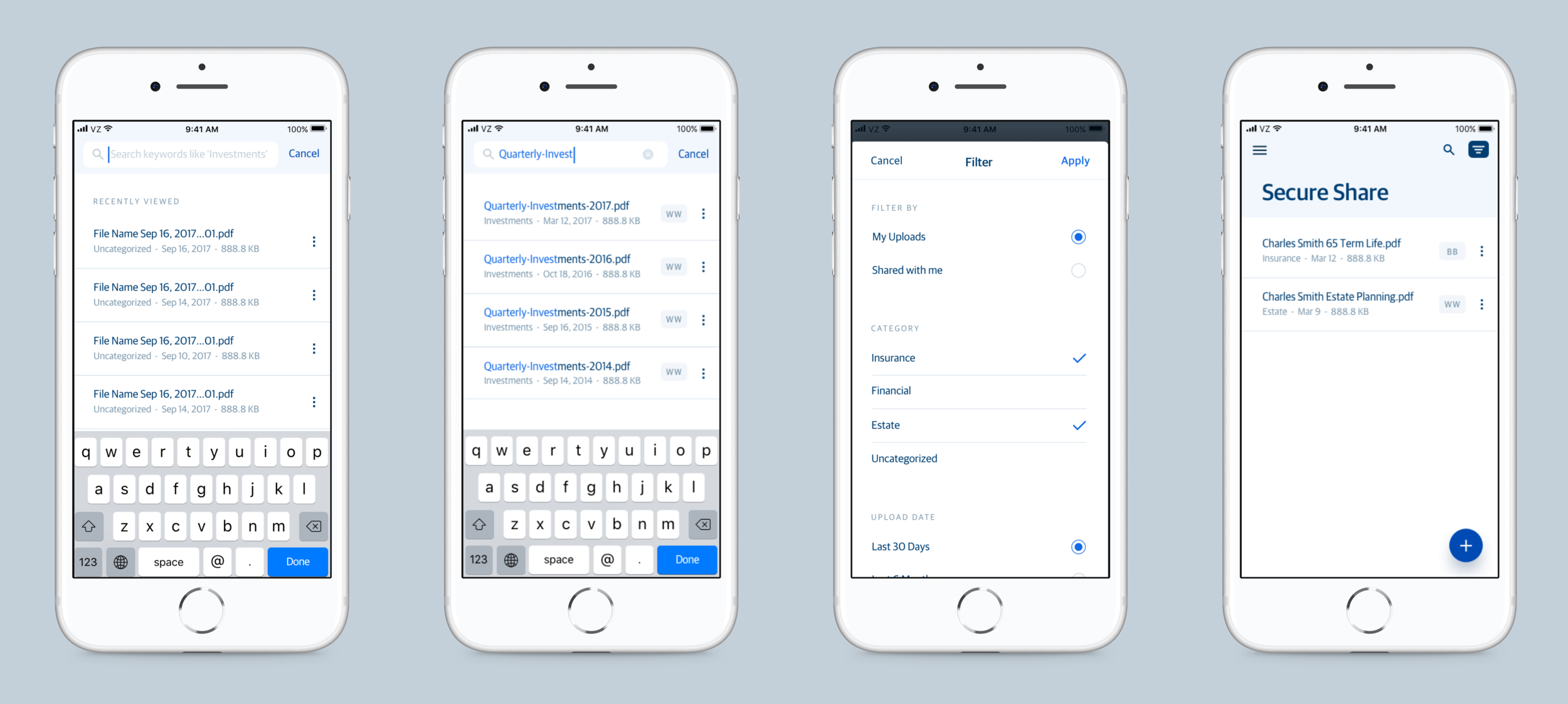
Sample key screens: Search and Filter